A spaghetti chart, also known as a spaghetti diagramm, is used to represent and visualize the weak points in a process. It is part of the process analysis tools and is complemented by the analysis tools:
- Process Flow Diagram
- Process function diagram
- Value stream diagram (value stream map)
The Spaghetti Diagram is an important part of Lean Production or Lean Six Sigma.
Example and Template
Here is an example of a spaghetti chart based on the following Spaghetti chart excel template.xls.
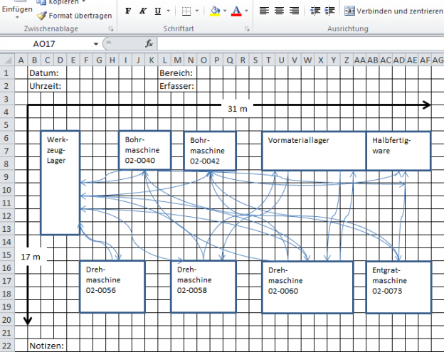
Aim of the Spaghetti Diagram
The spaghetti diagram represents an as-is picture of the situation. No optimizations or solutions are inserted into the diagram. A precise observation of the current situation on site (at the Gemba) is necessary. When creating the spaghetti diagram, the two types of waste – transport and movement – are shown and visualized. They are part of the 7 types of waste (muda, TIMWOOD), which are described in more detail in this article. For the spaghetti diagram one distinguishes the movement or transport of products, documents or people through a process.
The spaghetti diagram can therefore be used wherever movement or transport occurs. This can be a large production hall as well as a single assembly or office workplace. The objectives can be differentiated from the case under consideration. In the production hall the transport from place to place is more likely to be analysed. At the workplace in the assembly it is rather the movements of the worker or the workpiece that are subject to consideration.
The primary goal in the production of a spaghetti diagram is the visualization of waste. This first step is not about eliminating it. In general, a spaghetti diagram is based on a specific, delimited spatial work area.
Create Spaghetti Diagram
Sketch analysis area
- The work area to be viewed is recorded in detail and true to scale. On this basis, the paths can be very well calculated in the later evaluation. It often makes sense to use a floor plan of the work area. For this purpose, a checkered paper and a pencil are sufficient.
If you want to use a software Excel is sufficient. The replication of chequerd paper in excell and certain settings for drawing in Excel, which you will learn in this article, are helpful. You can download the completed Excel template here. - All machines and equipment are drawn in.
- Each object to be observed (employee, workpiece, document, etc.) is assigned a pen color or various symbols.
Determine period
The observation period is defined. A representative period must be selected, since the observation is the basis for the actual analysis. The actual analysis is the input variable for the optimization. If the period is not representative, the basis for the optimization is not meaningful.
- Every transport or every movement between individual locations is documented with a line. The line follows the transport or movement of the object. Do not combine several shipments into one line. Draw a separate line for each individual shipment.
- A good help is not only to observe the process but also to perceive the role of the object. This means that you run the path parallel to the object yourself or you execute the movements of the object yourself. This leads to a much deeper understanding of the situation.
- Mark intersections of paths, traffic jams, loops, etc. with individual symbols.
Record all movements. Frequently, movements are not recorded because they are not relevant or representative in the opinion of the upholder. However, you should also record these movements. Exactly these movements and transports cannot be planned at the desk, but belong to the everyday life of the process and form a huge potential for approaches to optimize the process. - Record additional information. These can be for example:
Names of participants, dates, times, special circumstances, etc.
The more actions take place between individual process items, the more lines are found on the diagram.
Evaluate result
The visualization of the observation allows a rough, quick assessment of the quality of the process. The more unproductive the process, the more confused the lines are on the layout. The more lines on the display, the more transport and motion determine the process.
The representation resembles a plate of spaghetti, which also explains the name of the diagram.
Data, which were additionally recorded during the visualization, allow a more detailed evaluation of the actual situation. Values such as walking and gripping distances, interruptions, transport distances and times and much more can be evaluated. The collected data thus form the basis for further analyses and show starting points for solutions.
Often the observer has discovered a multitude of possibilities for improvement during the observation. It has been shown that through an appropriate training effect, the observers can discover and name individual fields of action faster and better from image to image.
Reduce transport and movement
Based on the analysis, the potentials for optimization can then be recorded and implemented. The following questions should be answered by way of example:
- How can transports and movements be reduced?
- How can transports and movements be shortened and reduced?
- Can the position of facilities be changed in order to concentrate processes spatially?
- Can activities be combined locally in order to positively influence transports and movements?
Use very simple means for visualization. If you want to use documentation software for the spaghetti diagram, please do this very late in the process. With the software you usually lose a lot of flexibility when working out the actual state. The best way to draw a spaghetti diagram is by simple means. Often paper and pen are sufficient to document the actual state on site. Corrections or additions to the diagram can easily be made with these tools. Use your time for precise observation and not for operating software.
Spaghetti chart with Excel
If you want to use a software anyway, Excel or Visio has proven to be the best choice for the Spaghetti Diagram. In these programs it is very easy to display floor plans of work areas with symbols. Here is a corresponding Spaghetti chart excel template.xls.
Spaghetti Diagram Visio
At the moment I am still working on the implementation in Visio. Soon I will provide a template here as well.